
Analysis Performed and Written By:
Ashanti J.
Data Mining and Analytics: Telecom Customer Churn
Data extraction of the “Customer Data” web link was performed by using SAS software. The dataset was then imported into the software and read with the following code:

The SAS log indicated a successfully executed code extracting a total of 7,043 rows and 21 columns:

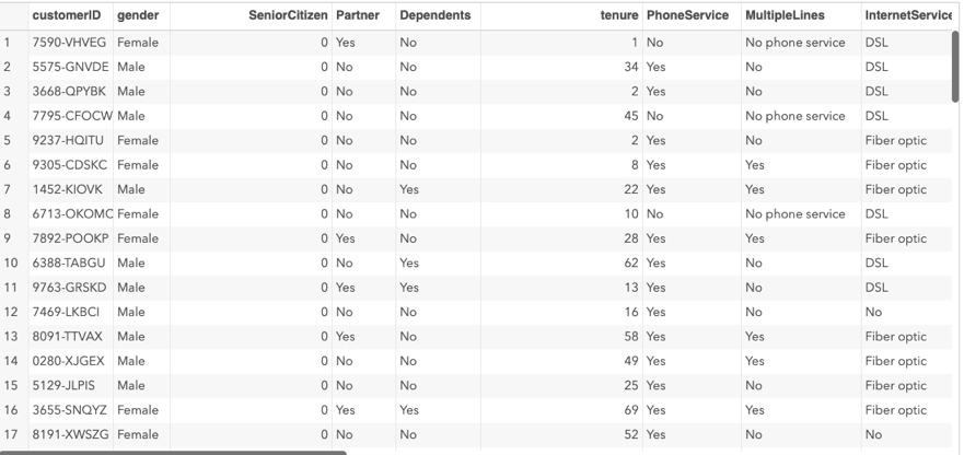
Here is a Snap-Shot of the resulting dataset table:
Why did I Choose to Use SAS as a Tool of Choice?
The benefit of using SAS statistical software to extract data in this scenario is the flexibility of the tool and its vast variety of data manipulation functions with powerful data visual analytic capabilities. Not to mention, its ability to process massive amounts of data and impressively fast speeds. SAS provides benefits enabling users to quickly create customized visualizations, reports, dashboards, and share insights via multiple platforms, including mobile devices. SAS University Edition is one of the only fourth-generation programming languages in the industry today. The ability to read data in any format, from any type of file, including binary files, variable-length data, free-form data, or even missing data. This is pertinent to this analysis because the targeted predicted variable is a binary variable. For these reasons, is why I have chosen to SAS software for my data analysis.
What are the Objectives and Goals of this Data Analysis?
The goals of this analysis are to estimate the customer survival function and the customer hazard function to gain better-knowledge of customer probability of churn over time of the customer’s tenure. Secondly, objectives of the analysis are to demonstrate how survival analysis techniques are used to identify the specific customers who are at high risk of churn and when will they churn. These objectives are within the reasonable scope of the scenario because the Data Analyst has been asked to analyze customer data to identify why customers are leaving and the potential indicators to explain why those customers are leaving so that the company can make an informed plan to mitigate any further loss. In summary, the scope of the following objectives is indeed appropriate for the criteria.
What Descriptive and Non-Descriptive Methods Did I Use To Analyze The Data?
The method used for descriptive data analysis in this scenario is Factor Analysis of Mixed Data (FAMD). This is because I will be analyzing mixed data using a binary response target variable and qualitative and quantitative predictor variables. Therefore, a Multiple Component Algorithm will be utilized using the PROC CORRESP procedure, due to the multiple categorical variables containing 2 or more levels. The MCA creates contingency tables from the categorical data and performs multiple correspondence analysis. This procedure locates all of the categorical variables within a Euclidean space and plots them via associations among categories. This method is appropriate for the goals and objectives that I have defined because it will allow me to analyze correlations between categorical data and provides visual charts and plots to perform discretization of quantitative variables and identify unknown correlations between data. In this analysis, this is pertinent because the data contains both categorical and numeric data that need to be correlated in order to further reduce the dimensions of the variables in the next step of the data analysis. Therefore, the categorical variables were converted into numeric data by using the Multiple Component Analysis specifically for the input variables for the PROC VARCLUS clustering algorithm. The PROC VARCLUS method divides the set of numeric variables into disjoint or hierarchical clusters. This is effective for this scenario due to the associated linear combination of associated clusters within each variable. This method leaves more options to obliquely cluster components and create an output dataset that can ultimately be used with the TREE procedure to better compute component scores for each cluster. The convenience of using PROC VARCLUS to cluster variables simultaneously enables an analysis of covariance matrices or the partial and complete correlations, performs weighted analysis, and automatically displays a tree diagram of hierarchical clusters via dendrogram. Now that the categorical variables have been converted into continuous variables, the dimensions of the data can be reduced by performing hierarchical clusters. The method used for non-descriptive/predictive analysis is Logistic Regression. I chose this method because the target variable in this analysis is a binary variable YES=Churn and NO=Do not Churn along with several categorical and numerical data. This method uses the log of odds as dependent variables to predict the probability of an event occurring by fitting the data to a logit function. Logistic Regression is appropriate for this analysis because Not only do logistic regression serves as a classification algorithm, it also can predict future phenomena based on current or past data.
Describe The Target Variable in The Data And Indicate The Specific Type of Data the Target Variable is Utilizing.
The target variable in this analysis is the Churn variable. This variable consists of binary character data that is nominal qualitative in nature. Churn is the target value because it is the phenomenon that we are trying to predict by assessing customer propensity of risk using past customer behavior data. Below is a screenshot indicating the format of the variable Churn:

Let’s take a closer look at the target variable Churn. A frequency plot was performed with the PROC FREQ SAS code concluded that over a period of time, a total of 27 percent of customers has churned:


What are the Independent Predictable Values and the Specific Type of Data Described?
The independent variables in the data and the specific type of data being used are indicated in the chart below:
Variable |
Role |
Class |
Description |
|
Contract |
Predictor Variable |
Nominal |
Month-to-Month One Year Two Year |
|
Dependents |
Predictor Variable |
Binary/Nominal |
Yes No |
|
DeviceProtection |
Predictor Variable |
Nominal |
Yes No No Internet Service |
|
InternetService |
Predictor Variable |
Nominal |
DSL Fiber Optic No |
|
MonthlyCharges |
Predictor Variable |
Numeric |
Continuous Quantitative Values |
|
MultipleLines |
Predictor Variable |
Nominal |
Yes No No Phone Service |
|
OnlineBackup |
Predictor Variable |
Nominal |
Yes No No Internet Service |
|
OnlineSecurity |
Predictor Variable |
Nominal |
Yes No No Internet Service |
|
PaperlessBilling |
Predictor Variable |
Binary |
Yes No |
|
Partner |
Predictor Variable |
Binary |
Yes No |
|
PaymentMethod |
Predictor Variable |
Nominal |
Electronic Check Mailed Check Bank transfer Credit Card |
|
PhoneService |
Predictor Variable |
Binary/Nominal |
Yes No |
|
SeniorCitizen |
Predictor Variable |
Binary |
0: No 1: Yes |
|
StreamingMovies |
Predictor Variable |
Nominal |
Yes No No Internet Service |
|
StreamingTV |
Predictor Variable |
Nominal |
Yes No No Internet Service |
|
TechSupport |
Predictor Variable |
Nominal |
Yes No No Internet Service |
|
TotalCharges |
Predictor Variable |
Numeric |
Continuous Quantitative Values |
|
CustomerID |
Predictor Variable |
Nominal |
Character Values |
|
Gender |
Predictor Variable |
Binary/Nominal |
Female Male |
|
Tenure |
Predictor Variable |
Numeric |
Continuous Quantitative Values |
What Is The Goal In the Manipulation of The Data and Data Preparation AIMS?
The Data set used in this analysis consists of exactly 7043 observations and a total of 21 variables. The goal in manipulation and aims for this scenario is to find homogeneous subsets, discover, detain, distill, document, and deliver pertinent information to analyze customer demographics to better drive bottom-up segmentation in order to correlate churn propensity. Subsequently, score the customer behavioral and usage data to predict the probability to churn within the next six months. This data will then be filtered against the high-value customers to determine those worth retaining. After the data is cleaned, the target variable Churn will be converted into a binary format consisting of the values 1=Churn and 0=No Churn. This with better help with the modeling process of scoring the observations. Once the data is cleaned, it will be split and partitioned into Train and Test in a 2/3 ratio. The training dataset will help fine-tune the model for maximum precision. The test dataset, on the other hand, will be used to score the data to ensure that it generalizes well with new data. This process ensures a non-biased model. To sample the training and validation data sets, the following SAS code was generated:

The sampling method used was simple random sampling without replacement. Sixty percent of the data is used and saved as the training dataset. The remaining 40 percent is saved into the validation dataset. This results in a sample size of 4,226 observations for the training data and 2,147 observations in the validation data.


After the data is split and partitioned, the PROC FREQ data step to analyze the new distribution of the Churn variable. The following code was executed:


As you can see, the previous original data set consisted of 5,174 (73 %) non-events and 1,869 (26 %) events. The training dataset consisted of 3,120 (73%) non-events and 1,106 (26%) events. While the validation data set consisted of 2,054 (72%) non-events and 763 (27%) events. However, in the new training and validation datasets, the distribution of events is consistent among the three datasets at 26% events. Now the data is ready to be modeled for the algorithm.
What Is The Statistical Identity of The Data?
Each row in the raw dataset represents a customer identified by a cutomerID. Each column contains the customer’s attributes which are described in the column’s metadata. The statistical identity of the data was obtained by using the PROC Contents procedure revealing a total of 7,043 observations and 21 variables. The PROC Contents procedure identified the following 21 variables and their respective data types:


Each record is identified by a unique CustomerID number. This Variable serves as a primary key to each customer’s records, ensuring there are no duplicated data within the dataset. The one dependent target variable is Churn, which is the essential criteria to be predicted in this analysis. The remaining 20 variables are independent predictor variables are broken down into three quantitative continuous independent variables: Tenure, MonthlyCharges, TotalCharges, and the following 16 categorical qualitative independent variables: Gender, PhoneService, MultipleLines, InternetService, OnlineSecurity, OnlineBackup, DeviceProtection, TechSupport, StreamingTV, StreamingMovies, Contract, PaperlessBilling, CustomerID, Partner, Dependents, and PaymentMethod. The following table summarizes and identifies the statistical identity of essential criteria and the phenomenon to be predicted. Class, Role, and Description of each variable are mentioned:
What Steps Was Used To Clean The Data And How Were Anomalies or Missing Data Addressed?
The contents of the data set were cleaned by first identifying any duplicate, missing, or incorrect data in the dataset. Within SAS, I created a new dataset titled “cleaned_data” to save the cleaned data before preliminary analysis. To identify adjacent rows that were entirely duplicated where values in every column matched, the data was sorted by using the following SAS code:

This SAS procedure code created an output dataset titled “cleaned_data” which contains the cleaned data free of duplicates along with an additional dataset titled “duplicates”, which contains the duplicates that have been removed from the data. Cleaned_Data output:

Duplicates Dataset:

As you can see, a null dataset of duplicate values has been returned indicating that there are no duplicate observations present in the dataset. In order to check for observations that have duplicated values in particular columns, the following SAS code was executed:

A total of 11 missing values for the variable TotalCharges was addressed by imputing missing value indicator variables via median imputation. Median imputation was used in this analysis because the amount of missing values represents less than 50% of the values in the population. The PROC STDIZE procedure was used to address numeric data with the REPONLY option to replace only the missing values. Otherwise, the variable value remains unchanged if it is not missing. The METHOD option specifies Median Imputation for the missing values. Missing value indicator variables were created with the following SAS code:


Once Median imputation was performed, a null output dataset indicated that there are no longer any missing data in any of the variables in the dataset.

What Are The Distribution of The Variables Using Univariate Statistics?
The explanatory analysis was performed to better prepare the data for customer survival Churn analysis. Univariate frequency analysis was conducted in order to pinpoint the data distribution, missing values, and outliers. To summarize the numerical variables, univariate statistics were performed via boxplot, histogram, and scatterplot. The measure of central tendency and distribution was analyzed via the Proc Means. The distribution of the variable Gender indicates a total 25.52% churn rate. Out of that 26.54 %, exactly 13.33% of females Churned and 13.20% males.
What Steps Was Used To Clean The Data And How Were Anomalies or Missing Data Addressed?

The following SAS code was executed to produce the distribution of the variable Tenure:

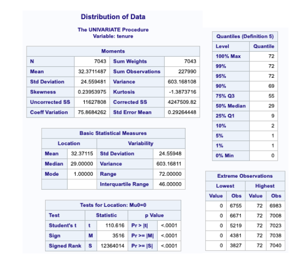

As you can see above, the distribution of the variable Tenure is not normally distributed.
The distribution for the variable Total charges:


The distribution of the Churn variable:

The distribution of the Gender variable:

The distribution of the MultipleLines variable:

The distribution of InternetService:

The distribution for the OnlineSecurity variable:

The distribution for the OnlineBackup variable:

The distribution for the TechSupport variable:

The distribution for the StreamingTV variable:

The distribution for the StreamingMovies variable:

The distribution for the Contract variable:

The distribution for the PaperlessBilling variable:

The Distribution for the Variable Dependent:

The distribution for the PaymentMethod variable:

What Are The Distribution of The Variables Using Bi-Variate Statistics?
The following SAS code was used to obtain bivariate statistics for Churn vs Gender is:

The following SAS code was used to obtain bivariate statistics for Churn vs MultipleLines is:

The following SAS code was used to obtain bivariate statistics for Churn vs InternetService is:

The following SAS code was used to obtain bivariate statistics for Churn vs OnlineSecurity is:


The following SAS code was used to obtain bivariate statistics for Churn vs OnlineBackUp is:

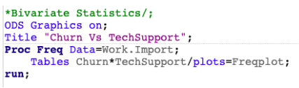
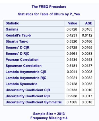
The following SAS code was used to obtain bivariate statistics for Churn vs TechSupport is:

The following SAS code was used to obtain bivariate statistics for Churn vs StreamingTV is:

The following SAS code was used to obtain bivariate statistics for Churn vs StreamingMovies is:

The following SAS code was used to obtain bivariate statistics for Churn vs Contract is:

The following SAS code was used to obtain bivariate statistics for Churn vs Dependents is:

The following SAS code was used to obtain bivariate statistics for Churn vs PaymentMethod is:


The following SAS code was used to obtain bivariate statistics for Churn vs TotalCharges is:


The following SAS code was used to obtain bivariate statistics for Churn vs Tenure is:

What Are The Analytic Methods Applied To The Data?
A combination of factor analysis on mixed data (FAMD) and hierarchical models was used to cluster variables with similar variables via aggregation. Specifically, a multiple correspondence analysis was conducted on the categorical nominal variables to convert it into numeric continuous variables for subsequent use in the PROC VARCLUS clustering method. The data was first transformed using the following PROC CORRESP procedure within SAS:

This procedure creates a contingency table from categorical data while performing multiple correspondence analysis. This procedure locates all of the categorical variables within a Euclidean space and plots them via associations among categories. The multiple component analysis produced the following output:


Once the MCA was complete, the data were then clustered using the PROC VARCLUS method. This method better represents my findings better than other methods because it divides the set of numeric variables into disjoint or hierarchical clusters. This is effective for this scenario due to the associated linear combination of associated clusters within each variable. This method leaves more options to obliquely cluster components and create an output dataset that can ultimately be used with the TREE procedure to better compute component scores for each cluster (SAS Institute Inc.). The convenience of using PROC VARCLUS to cluster variables simultaneously enables an analysis of covariance matrices or the partial and complete correlations, performs weighted analysis, and automatically displays a tree diagram of hierarchical clusters via dendrogram. Now that the categorical variables have been converted into continuous variables, the dimensions of the data can be reduced by performing hierarchical clusters. The following SAS code was executed to cluster and segment the data:


As you can see from the dendrogram and supporting charts above, the 4 variables Tenure, MonthlyCharges, TotalCharges, and SeniorCitizen has been reduced for 4 dimensions to 2. The variables Tenure, TotalCharges, and MonthlyCharges are clustered into one variable. These methods combined reduced the dimensions of data overall from 20 to 12 variables without losing too much variation explained by the clusters. These will be further reduced once the logistic regression model is performed for predictive analysis. Once the dimensions of the variables were reduced and the data was segmented, the PROC LOGISTIC algorithm was executed to predict customers at risk of churning from the company within the next six months. Logistic regression better represents the findings in this analysis than other methods because it not only predicts the phenomena, but it serves as a classification method as well. The target variable in this analysis is binary and the predictor variables are a combination of qualitative and quantitative variables, which makes logistic regression the perfect candidate for this model. Furthermore, the output of the logistic model is far more informative and detailed than other classification algorithms. This is because logistic regression not only provides measures of how relevant a predictor is but also its direction of that association whether it is negative or positive. For these reasons, the Logistic Regression model was most appropriate for this specific analysis. To conduct the logistic regression on the data, the following SAS code:

The Logistic Regression Model was executed on the Training dataset. Here, you can see that the total number of observations read into the model is 4,226 and the total number of observations actually used is 4,217. The frequency of the predicted response variable Churn is a total of 1,104. The categorical variables were dummy coded into design variables by the logistic regression procedure:

As you can see below, the model converged with the -2 Log L=4848.948 as the intercepts.

Stepwise model selection was used to enter a total of 8 variables into the model one at a time. The Contract variable was the most significant and the first to be entered into the model with a Score Chi-Square of 676.3247. The next most significant into the model was the variable InternetService, followed by Tenure, PaymentMethod, MultipleLines, TotalCharges, PaperlessBilling, and OnlineBackup respectively. However, all of the variables used in the final model are significant.


The C-Statistic of the logistic regression model is .84. This statistic identifies how many times the model was correct when the odds ratio analysis was executed on the data. This also is equivalent to the R square statistic in the Linear Regression models, therefore, it can be stated that 84% of the variation in this data is explained by the model.

The variables in the Odds Ratio Estimates are deemed statistically significant as long as the 95% Confidence Limits do not cross over the 1 threshold. Meaning, as long as the confidence intervals are above or below 1, they are statistically significant.

The ROC curve has a fairly large area under the curve indicating a good model bulging closer to the 1 threshold. ROC comparisons are plotted below:


The predicted probabilities plot below shows the effect of tenure on the following variables and what the actual impact is.

The Final model consists of a total of 8 remaining variables: Tenure, TotalCharges, MultipleLines, InternetService, OnlineBackUp, Contract, PaperlessBilling, and PaymentMethod.

While the following 5 variables were removed: MonthlyCharges, SeniorCitizen, Partner, PhoneService, and DeviceProtection.

The final model converged with an AIC criterion of 4850.948

The final model predicts that a total of 902 customers will churn in the near future. This is a total 26% of the customer population.


The output of the Logistic Regression model produced the following dataset titled OutMod, containing the predicted probability rates which determine the “Predicted_Churn” via a 0.5 cut off rate:

The OutMod output dataset from the logistic model was then tested against the validation data set using the following SAS code:

The data was then scored using a 0.5% cutoff with the following SAS code:

Establishing a cutoff threshold of 0.5 gives the modes 95% confidence. The previous SAS code produced the following output dataset containing the final Customers who have the predicted probabilities that fell below the 0.5 cutoff level. The histogram and QQ-plot visualize the distribution of the predicted parameters:

The confusion matrix below reveals the accuracy of the model is 80.66 % the error rate is 19.33%, the sensitivity is 65.89%, the specificity is 84.68%, the positive predicted value is 53.89%, and the negative predicted value is 90.13%. With 80 % accuracy, this indicates a fairly good training predictive model.

The following SAS code was executed to test the predicted Churn Customers by dividing them into separate bins:


The following output of binned data was created below:

Histogram and QQ-plot of Bins:

How Are The Methods I Have Chosen To Analyze The Data Justified?
The methods I have chosen are better suited to represent my findings than other methods are because Clustering by aggregation of similarities enables the analysis of all the individual pairs at each step, thus building up a global clustering, instead of local clustering as in hierarchical clustering methods. This method also determines the optimum number of clusters automatically, instead of fixing them in advance. Unlike other evaluative methods, clustering by similarity aggregation has the power to transform and process missing values without transforming them (Tufféry S.). This is significant because there were some missing values found in the dataset during the preliminary analysis and leaves more options to obliquely cluster components and create an output dataset that can ultimately be used with the TREE procedure to better compute component scores for each cluster (SAS Institute Inc.). The convenience of using PROC VARCLUS to cluster variables simultaneously enables an analysis of covariance matrices or the partial and complete correlations, performs weighted analysis, and automatically displays a tree diagram of hierarchical clusters via dendrograms. Therefore, because clustering by similarity aggregation is considered a relational analysis based on the representation of data in the form of equivalence, it is better suited to represent my findings in this analysis than other methods. Logistic regression better represents the findings in this analysis than other methods because it not only predicts the phenomena, but it serves as a classification method as well. The target variable in this analysis is binary and the independent variables are a combination of qualitative and quantitative variables, which makes logistic regression the perfect candidate for this model because it can handle discrete, nominal, or ordinal dependent variables. Unlike other predictive methods, Logistic Regression’s conditions are less restrictive than those of linear discriminant analysis. It also detects global phenomena, whereas decision trees only detect local phenomena. Furthermore, the output of the logistic model is far more informative and detailed than other classification algorithms and have the ability to handle non-monotonic responses. Because logistic regression not only provides measures of how relevant a predictor is but also its direction of that association whether it is negative or positive, it is better suited to represent my findings in this analysis than other methods.
How Are The Methods I Have Chosen To Visually Present The Data Justified?
I chose the method of using histograms to visualize the distributions of the continuous numeric variables. This allowed me to observe if the data was normalized or not. Variables, such as Tenure, TotalCharges, MonthlyCharges SeniorCitizen, and TotalCharges are binned into buckets, makes this method appropriate for the churn analysis. Another Method chosen to visually present data is utilizing a bar-graph. This method is used to present many categorical variables such as Partner, PhoneService, MultipleLines, InternetService, OnlineBackUp, DeviceProtection, Contract, PaperlessBilling, and Payment Method. The bar-graph allows me to compare data among different categories, therefore, uses two axes. The Box-Plot was also used to visualize and compare the distribution of data based on the minimum quartile, first quartile, median, third quartile, and the maximum against other variables. This is helpful in detecting outliers in the data and identifies the symmetry and skewness of the distribution. QQ-Plots were used in the analysis to compare two probability distributions via quantiles once the model was fitted. The scatterplot was used to visualize the correlations between the categorical variables in the Multiple Component Analysis. This method also observed outliers and clustering within the data. Once the data dimensions were reduced via the clustering algorithm, a dendrogram was used to visualize the combined variables from the PROC VARCLUS algorithm. To observe the performance of the model, the Odds Ratio Plot was used to identify significance. The ROC chart was used to visually present the sensitivity and specificity of the model, and Interaction plots were used to visually present interactions and their significance on the target variable. Altogether, these previous methods are appropriate for the objectives of the Churn analysis and better than other methods because they are specific to the data being used.
Data Summary
The data shows that the model successfully discriminated and predicted the phenomenon of Churn. A ROC Plot was fitted to the data and shows a significant area under the curve (C-Statistic=84.2):

As you can see, the ROC curve of the final model bulges closer to 1, indicating a highly discriminating and predictive model. A model with high discriminating ability will also have high sensitivity and specificity simultaneously. If the model fails to discriminate, then the ROC curve will be a 45-degree diagonal baseline. However, our model is significantly better than the baseline. The model also successfully predicts the phenomenon of Churn because the sensitivity and specificity derived from the confusion matrix below indicates an accuracy rate of 80.66 % the error rate is 19.33%, the sensitivity is 65.89%, the specificity is 84.68%, the positive predicted value is 53.89%, and the negative predicted value is 90.13%. With 80 % accuracy, this indicates a fairly good training predictive model.

What Are The Methods Used To Detect Interactions And For Selecting The Most Important Predictor Variables?
The optimization technique used on the response variable Churn is Fisher’s Scoring Method. The method used to detect interactions is visualizing the predicted probability interaction plot. The probability plot below indicates an interaction between the variables MultipleLines*InternetService. Notice the sigmoidal probability curves all overlap and are not equally shaped. This probability plot visually displays the length of Tenure depends on the variables MultipleLines and InternetService, causing an interaction effect.

On the contrary, the method used to select important predictor variables is the P-Value. As you can see in the Type 3 Analysis of Effects below, the following variables are significant:

However, the Wald Chi-Square statistic and Odds Ratio Plot are used to determine the most important variable in the model is the variable InternetService with a Chi-Square of 77.7744. Illustrated in the Odds Ratio Plot below, the variables that cross the 1 threshold, are deemed insignificant variables, which are indicated in the red. The variables indicated in the green are considered significant and does not cross over the 1 odds ratio threshold:

Therefore, these were the methods utilized to detect interactions and determine significant variables within the model.

The predicted probability diagnostics plots below indicate interactions and main-effects within the model:

In summary, a total of 903 customers are predicted to be at risk for voluntary churn from the telco company in the near future. The predictive Logistic Regression Model reveals the accuracy of the model is 80.66 % the error rate is 19.33%, the sensitivity is 65.89%, the specificity is 84.68%, the positive predicted value is 53.89%, and the negative predicted value is 90.13%. With 80 % accuracy, this indicates a fairly good training predictive model.

Author: Cod3bot
Owner/CEO